

Custom dashboards show how your website visitors engage with Qualified, how your reps perform, and how many meetings and leads your experiences produce. Build a dashboard from the tiles that matter to your team, filter it to the visitors you care about, and share it with people outside of Qualified.
Build a custom dashboard
A custom dashboard is made of tiles you choose from a library. Each tile reports on one metric, funnel, leaderboard, or chart. You can filter the whole dashboard, filter individual tiles, and relabel funnel steps to match the terms your team uses.
Create a dashboard
To create a new custom dashboard in Qualified, navigate to Analytics → Dashboards and click the + button.
Then, add tiles to your dashboard by following these steps:
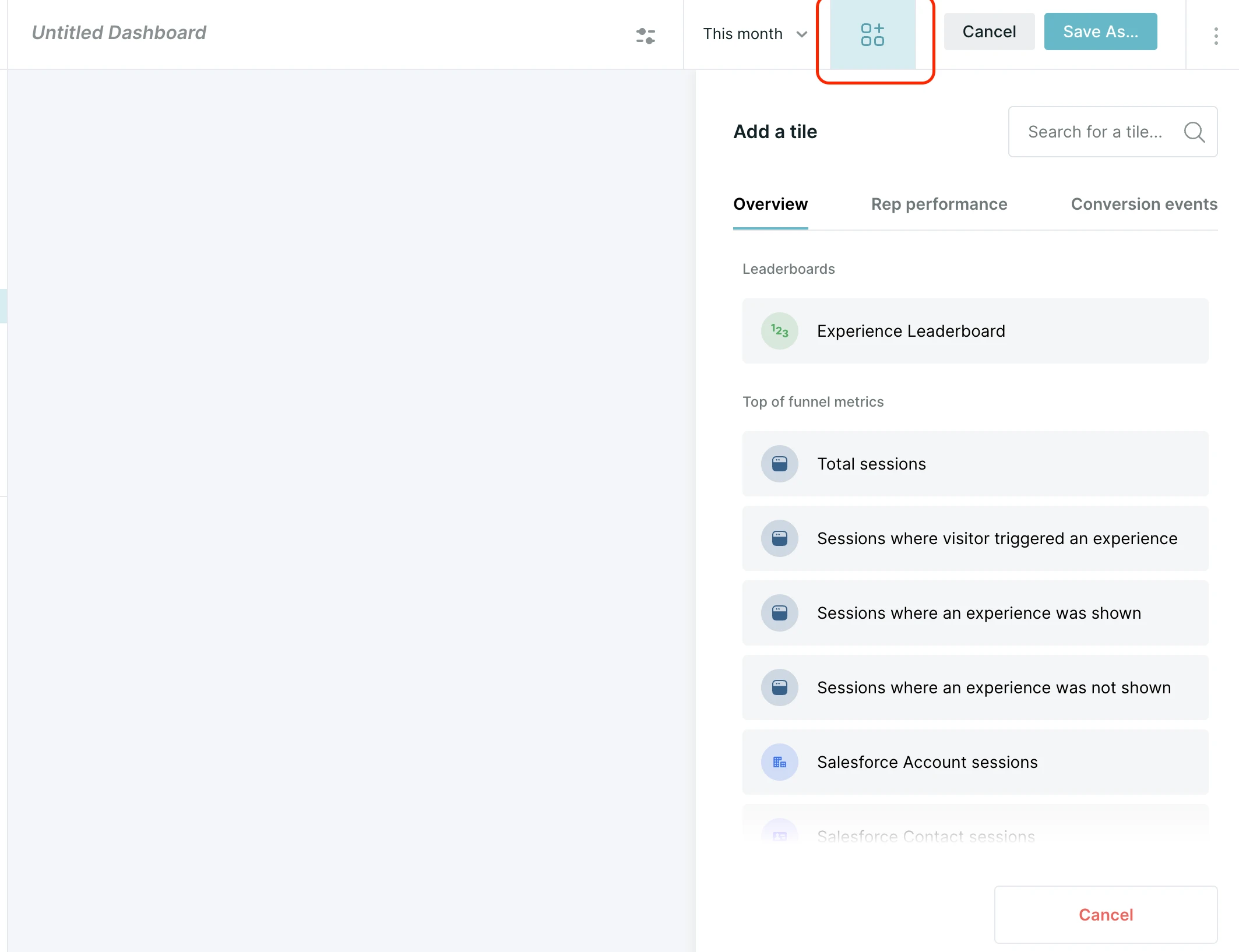
- Select the Add Tile icon in the upper right side of the screen (this will be done automatically for your first tile).
- Browse or search for the tile to add. Tiles are sorted into three tabs and several subsections, detailed below:
- Overview
- The Experience Leaderboard.
- Top-of-funnel metrics, like session counts and Salesforce sessions.
- Routing tiles for conversation handoffs to human reps.
- Rep Performance
- Leaderboards for all reps, inbound chat, and pouncing.
- Engagement and other chat funnels.
- Rep availability.
- Inbound chat success metrics.
- Pounce metrics.
- Conversion events
- Meeting Channel Leaderboard.
- Rules-based bot and human rep conversations.
- AI SDR agent conversations.
- Calls.
- Meetings offered, booked, rescheduled, and canceled.
- Lead captures.
- Overview
- Select the desired tile.
- Repeat for each tile to include.
Customize tiles
Once a tile has been added to your dashboard, you can customize its title, appearance, and more. Customizable features of tiles include:
- Display title
- Color
- Icon
- Tile type
- Standard: Displays the tile’s core metric, i.e. meetings offered or sessions.
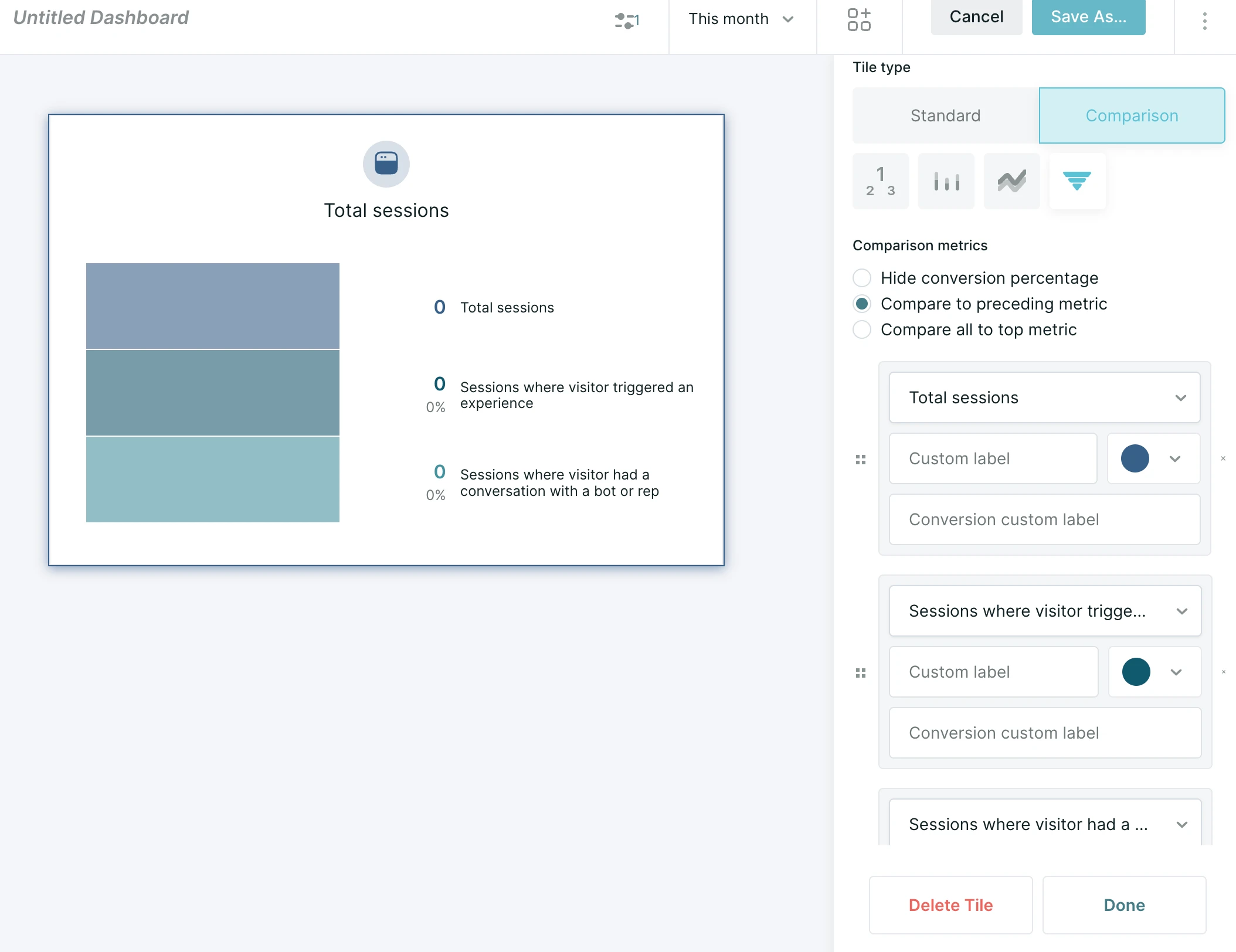
- Comparison: Compares two or more metrics. Use the drop-down menus to add additional metrics and optionally provide custom labels, and depending on visualization type, custom colors for them.
- Visualization type
- For standard tiles, this includes a number display, bar chart, date heatmap, or line graph.
- For comparison tiles, this includes number displays, bar charts, stacked line graphs, or funnels.
Compare and label funnel steps
Funnel tiles show each step as a count and a conversion percentage. In the tile settings, choose how the percentage is calculated:
- Hide conversion percentage: do not show a percentage for each step.
- Compare to preceding metric: each step's percentage is based on the step directly above it.
- Compare all to top metric: each step's percentage is based on the first step in the funnel.
Each funnel step also has a Custom label field, which renames the metric, and a Conversion custom label field, which renames the percentage.
Filter every tile on a dashboard
Dashboard filters apply to every tile on the dashboard. Use them to focus the dashboard on a specific audience or to exclude traffic you don't want counted.
To access filter settings for the entire dashboard, click the filter icon in the top-center of the screen.
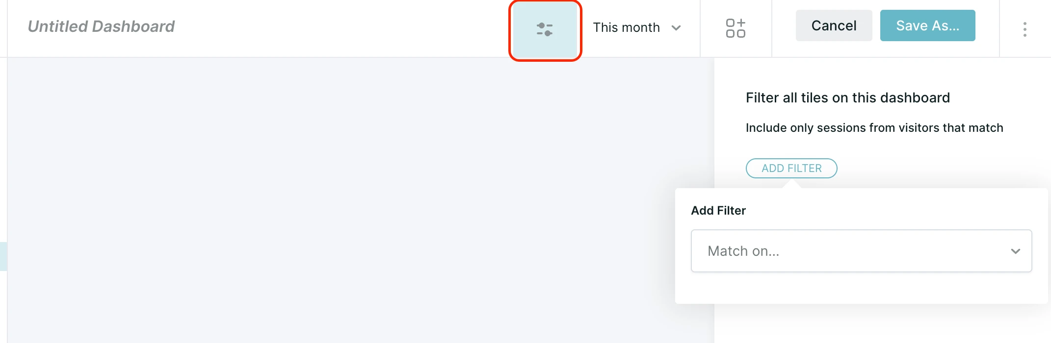
Add one or more filter conditions, linked with AND or OR logic, to define the desired audience. Examples include filtering to only display conversations that happened during business hours or only leads whose emails are known.
Filter a single tile
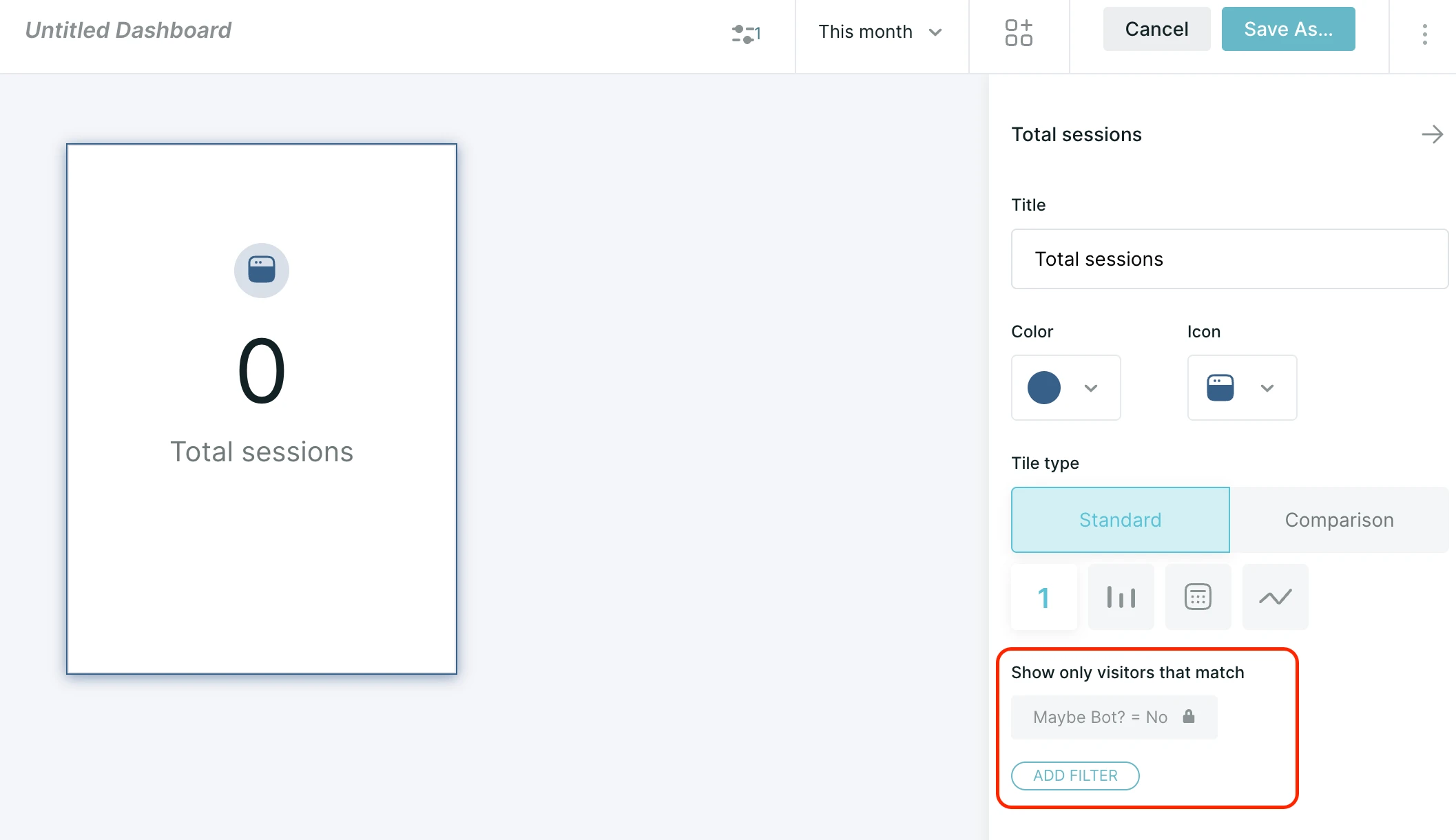
Each tile can also carry its own filter. In a tile’s settings, use Add Filter under the Show only visitors that match heading to select criteria that will filter for that tile only.
Note that any filters which have been applied to the entire dashboard here will appear as reminders, with a lock icon to indicate they cannot be altered.
About Qualified dashboards
Qualified dashboards break down your website traffic and display how those visitors interacted with Qualified during their sessions. Within Qualified dashboards, review your sales team's availability, which reps interact with the most visitors, and which reps create the most leads.
Dashboard definitions
Below we'll define terms specific to Qualified that you'll see in the various dashboard tiles. These sections reveal important information about your website visitors and their interactions with Qualified.
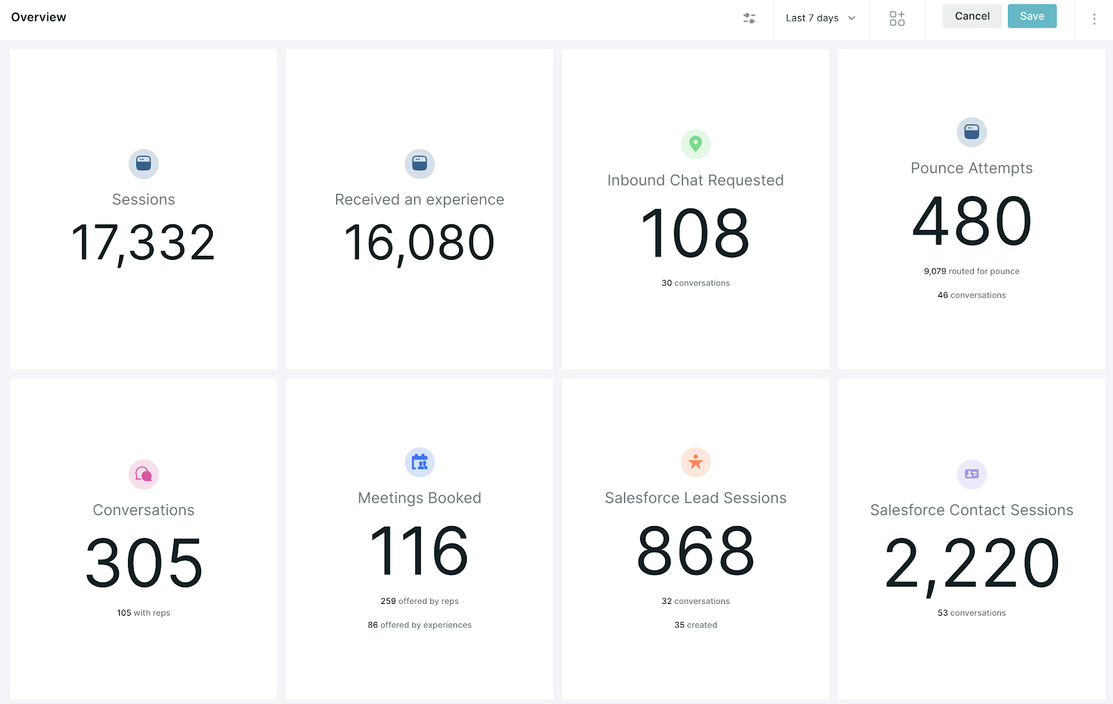
- Sessions: A session is defined as every time a visitor is on the website. A session will end for a visitor when they are idle for more than 60 minutes or a visitor left your site for at least five minutes before returning. A visitor can have multiple sessions on your website.
- Experiences: An experience is the Qualified message and flow that you've created to show up on a particular page, for a particular visitor set, or triggered by a button or form on your website.
- Waiting for reps: This is defined by Qualified as any visitor who has hit your Route for Inbound Chat step within your experience and waited for a rep to pick up the conversation. This includes all visitors who were shown the meeting booker (no reps available), visitors who waited and did not receive a chat (reps available but did not start a conversation), and those visitors who did have a conversation with your sales team.
- Conversations: A conversation is defined as a back and forth interaction between a visitor and either a human rep on your team, your AI SDR agent, or a legacy rules-based bot.
Using your dashboard
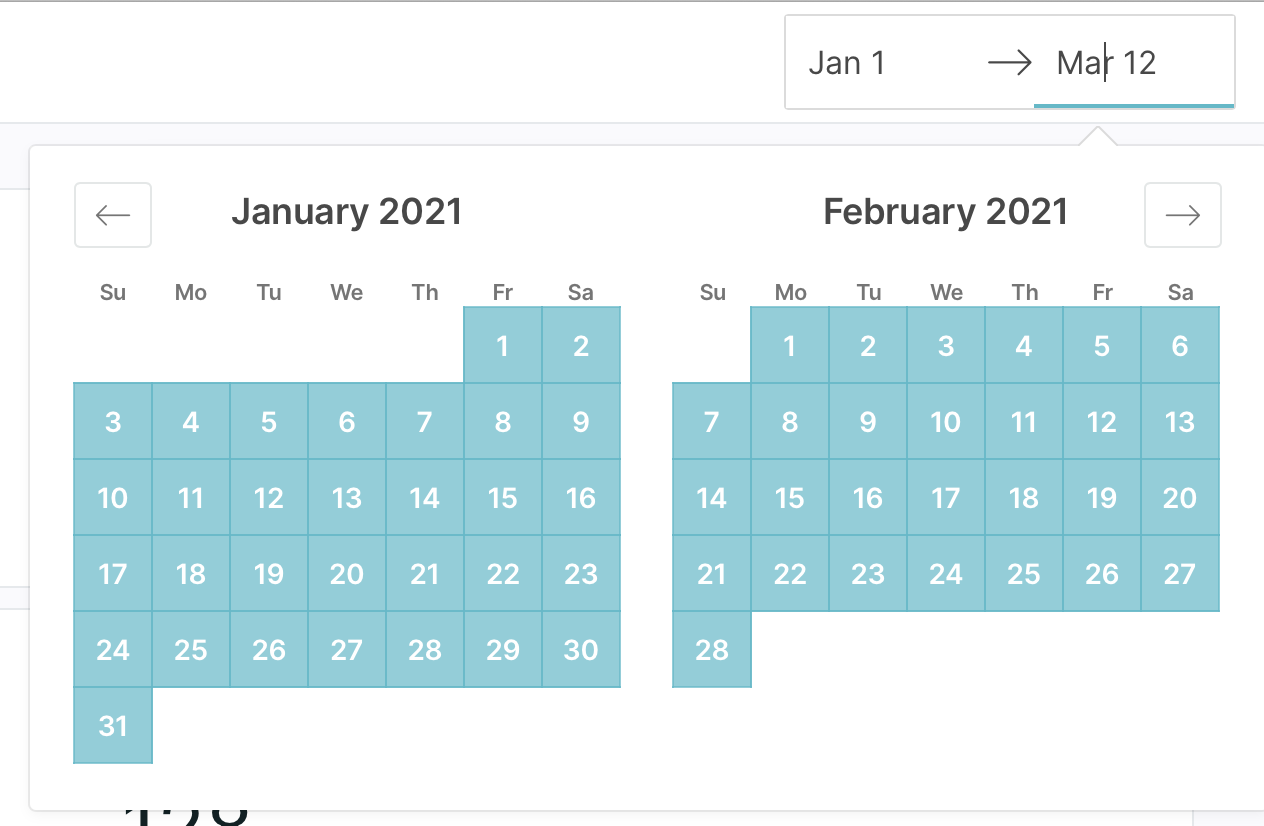
Use the date picker on the top right corner of your dashboard to select the dates you’d like to filter your data by. You'll notice that data is only available for the previous 18 months. Any data prior to 18 months will not be displayed in app. Please reach out to your Qualified Success Architect for any questions or data requests.
Business hours in reports and dashboards
Qualified can report on sessions that took place during or outside your business hours.
Note: To enable this feature or learn more about availability for your organization, contact your Qualified Success Architect (QSA).
Set up your business hours in Qualified before using these filters. Qualified doesn't fill in default hours, so the filters have nothing to compare against until you set them. See Configuring business hours.
Qualified supports one set of business hours for your organization. Teams that work across several regions can't report on each region's hours separately.
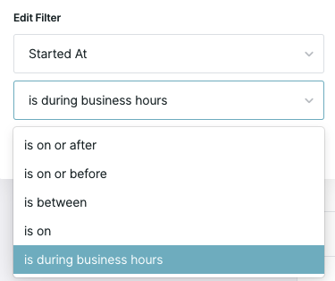
In reports, add a Started at or Ended at filter. The operator dropdown includes is during business hours and is outside business hours.
In dashboards, use the dashboard filter panel to include only sessions that occurred during or outside business hours. When you select a number on a filtered tile, the report that opens carries the same business hours filter.
Dashboard tiles
To see more detail behind each number in your dashboard, click the number in the tile to open a related report. Each report shows the visitor sessions that correspond with the tile during the date range you've selected. To build your own reports, see Using custom reports.
Salesforce lead sessions
The large number on this tile represents the number of sessions on your site that a lead had. One lead can have multiple sessions within your date range, and Qualified counts all of them.
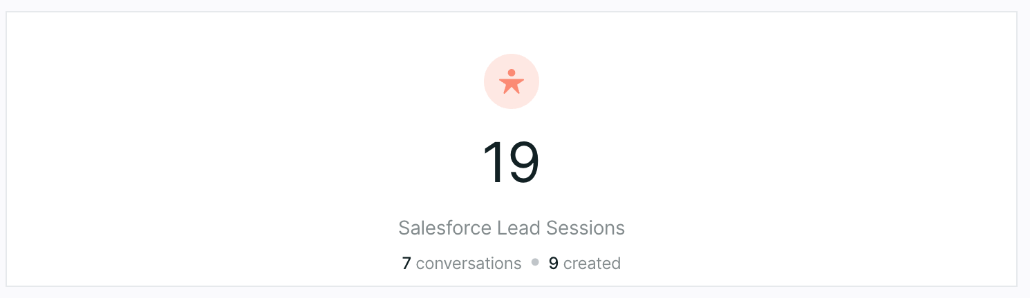
The two smaller numbers show:
- The number of conversations between your agent or your sales reps and the lead
- How many new leads Qualified created
Salesforce contact & account sessions
These numbers show the number of sessions, including conversations, from visitors associated with a Salesforce contact or account record. (At this time, Qualified does not create contacts or accounts.)
Meetings booked
In this tile you'll be able to see all sessions where meetings were booked with a visitor. It shows meetings offered by reps and meetings booked by your agent. Click on the numbers to drill down and see which reps offered the meetings as well as which experiences are capturing the most meetings.
Dashboard charts
The dashboard tiles give an overview of each metric tracked by Qualified. The first tile you see at the top provides an overview and overall number of each metric, while the tiles below show the differences over time.
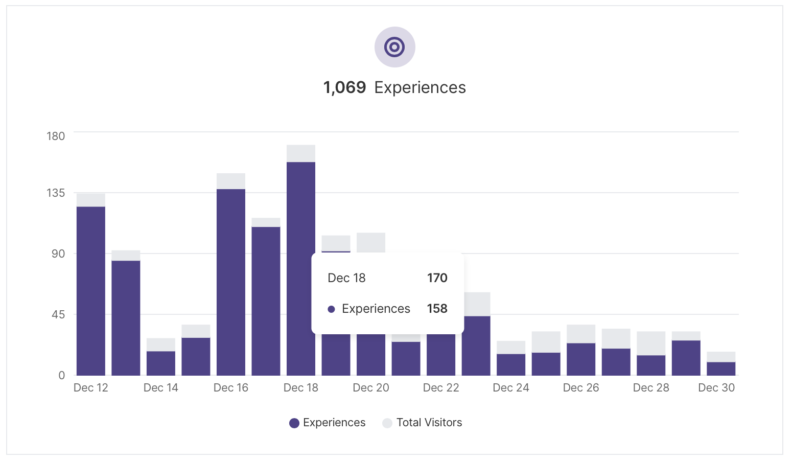
Experiences
Each time an experience is triggered on your site, we’ll count it here. This does not necessarily mean that a visitor has clicked on your experience, rather that it was triggered for a visitor.
Scroll down to the very bottom of your dashboard to see a break down of which experience has been the most engaging to your visitors.
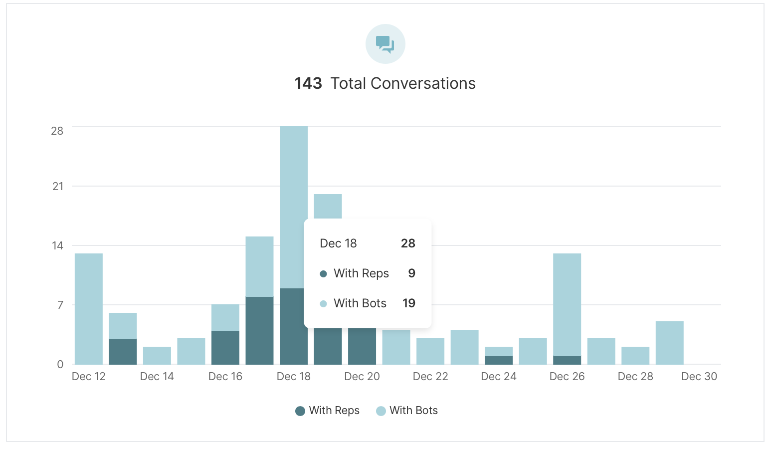
Conversations
You can see how many conversations your team has had by hovering over each day to see more details as well as a break down of your conversations by your agent or reps.
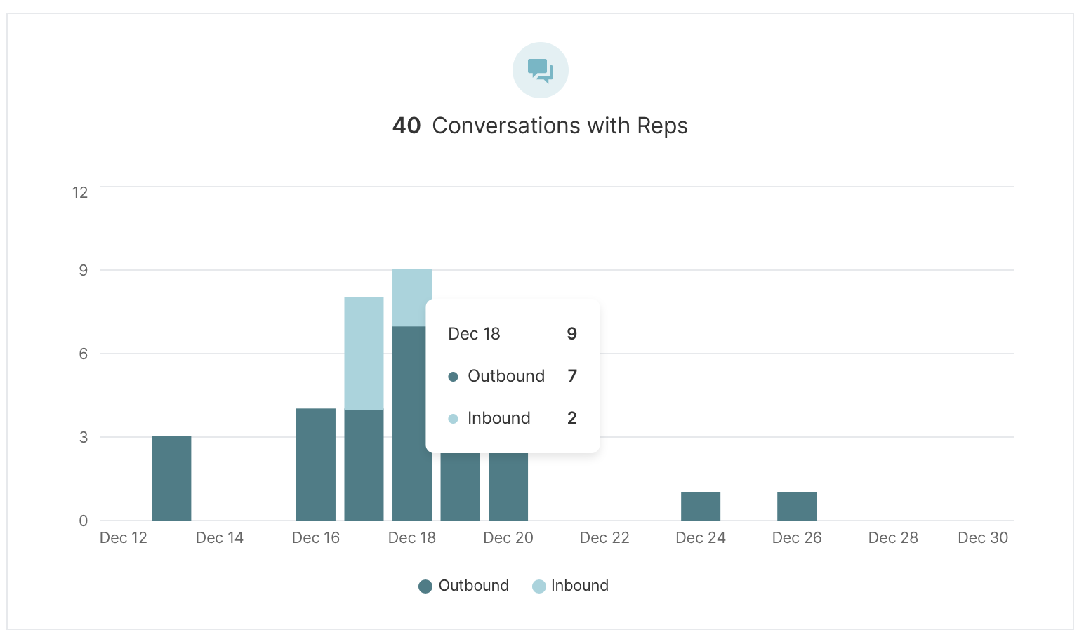
Conversations with reps
Next to your overall conversations breakdown, you’ll see a bar chart that breaks down visitor conversations with your reps: outbound vs. inbound. Outbound conversations are those that have been started by your reps while inbound conversations are those first started by your visitors. Your inbound and outbound figures may add up to less than your total conversations. Total conversations include chats that were re-routed or transferred between reps, and the inbound chat and pounce figures leave those out.
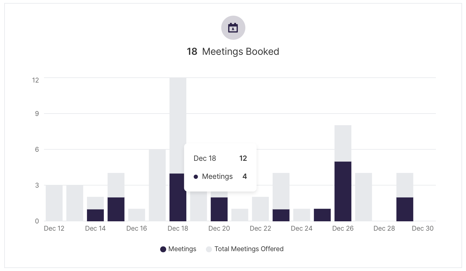
Meetings booked
Meetings booked will show you how many visitors have engaged with your experiences and booked a meeting with one of your reps.
This could mean that the meeting booker was triggered by the agent or manually given to the visitor by a sales rep. Hover over the bar chart to see more details on each day shown.
Waited for reps
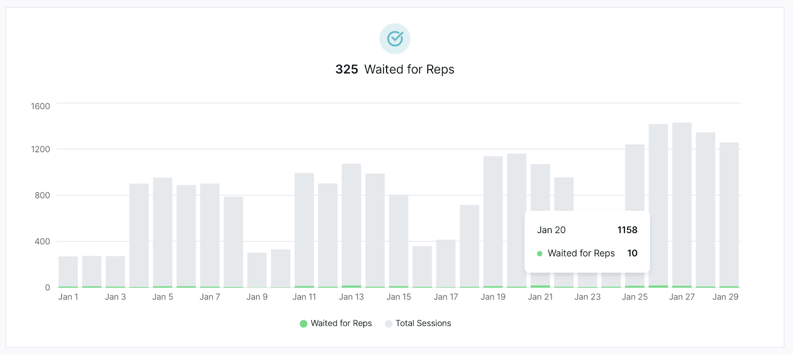
Waited for reps tiles show which visitors reached your Qualified routing rules that have been set in your experience and have waited to speak with someone on your team.
You’ll notice these rules when you open up your experience and see the Route for inbound chat step. Hover over the bars in the chart to see how many sessions took place during that day versus how many visitors waited to speak with your sales team.
Leads created
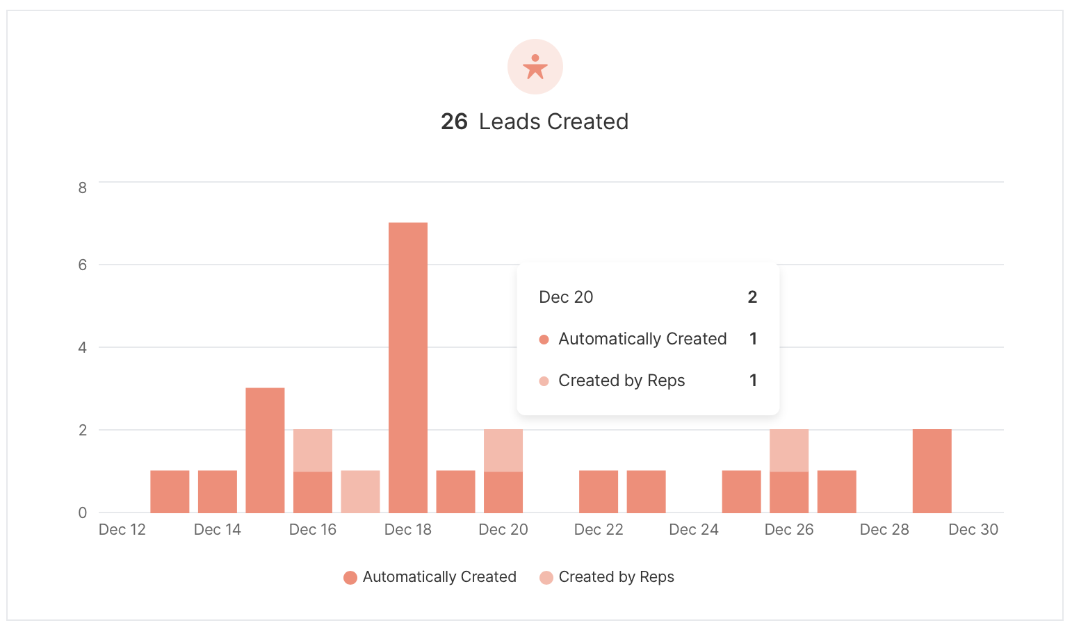
Next in your dashboard you’ll see how many leads have been created from your experiences. You’ll only see this piece of your dashboard when you use Salesforce to sync your visitors as Leads.
Prospects created
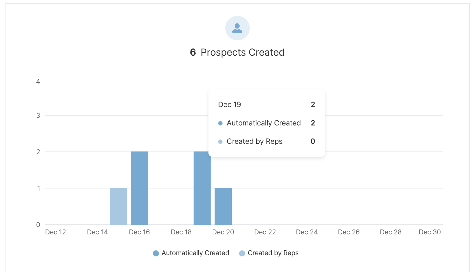
If you use Pardot to sync your Prospects, you'll see a section in your dashboard for Prospects created from Qualified. We'll give you a break down of how many of these Prospects were created automatically using the rules in your experiences or created by your reps manually.
Live Booker and Meeting Links data in dashboards
Meetings booked through the Live Booker or Meeting Links happen outside a website session. Qualified includes them only in meeting-based tiles, so they don't change your session-based metrics.
Tiles that include Live Booker and Meeting Links data
These 13 tiles include meetings from Live Booker and Meeting Links:
- Total meetings offered
- Total meetings booked
- Meetings offered not booked
- Meetings booked by links
- Meetings offered by links
- Meetings canceled by links
- Meetings rescheduled by links
- Meetings rescheduled
- Meetings canceled
- Meetings canceled due to no confirmation
- No-show meetings
- Meetings offered by Live Booker
- Meetings booked by Live Booker
The Meeting Channel Leaderboard also includes this data, with Live Booker listed as its own channel.
Tiles that exclude Live Booker and Meeting Links data
Every other tile and leaderboard is session-based and excludes Live Booker and Meeting Links data. Reports opened from these tiles include the filters Via Live Booker? = No and Via Meeting Links? = No, so the report matches the tile.
Session-based tiles used to include Meeting Links data. If you compare them with figures from before this change, some counts will be lower.
The Via Live Booker? and Via Meeting Links? filters are also available when you build your own reports.
Rep performance components
The Qualified Rep Performance dashboard gives you a detailed overview of your sales team's success and availability using Qualified and allows for you and your team to break down metrics that mean the most to your success.
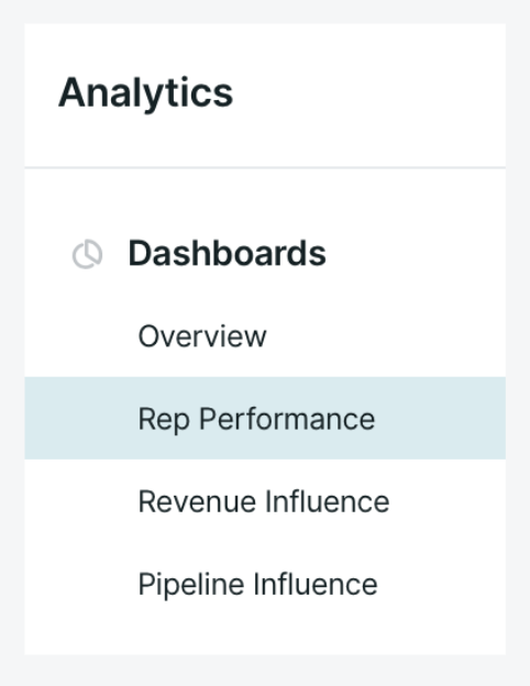
To get started, navigate as an administrator to Analytics → Rep Performance within your Qualified instance.
Rep performance definitions
Below we'll define terms specific to Qualified that you'll see in the various dashboard tiles. These sections reveal important information about your website visitors and their interactions with Qualified.
- Sessions: A session is defined as every instance a visitor is on the website. A session will end for a visitor when they are idle for more than 60 minutes or a visitor has left your site for at least five minutes before returning. A visitor can have multiple sessions on your website.
- Waiting for reps: This is defined by Qualified as any visitor who has hit your Route for Inbound chat step within your experience and waited for a rep to pick up the conversation. This includes all visitors who were shown the meeting booker (no reps available), visitors who waited and did not receive a chat (reps available but did not start a conversation), and those visitors who did have a conversation with your sales team.
- Conversations: A conversation is defined as a back and forth interaction between a visitor and either a sales rep on your team or your agent.
- Pounce: Pouncing is a Qualified term meaning to proactively engage with a visitor before they ask to chat with a rep. Onsite routing rules usually determine which high-value visitors appear in your reps' Live Stream, where reps have the opportunity to proactively engage.
Rep performance charts
Sessions routed to reps for pouncing
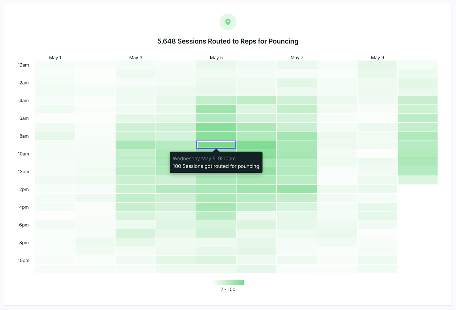
Use this dashboard tile to track how many visitors were routed to your sales rep. Click on a tile within the dashboard to see more details, including the exact visitor count within the hour.
See a drill-down of the visitor details by clicking on the date on the top of each column. This will take you to all visitors routed for conversations during this day including which experiences they received.
The times in the dashboard will reflect the time zone set in your Qualified profile.
Successful pounce conversations
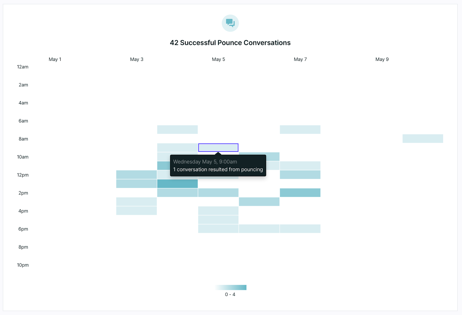
The next dashboard tile shows how many of your sales reps attempted to pounce on your visitors and had a successful conversation with them. Notice the data tile you’ve selected follows you to the next tile making it easy to see the successful attempts during the same time frame.
Sessions waited for reps to join
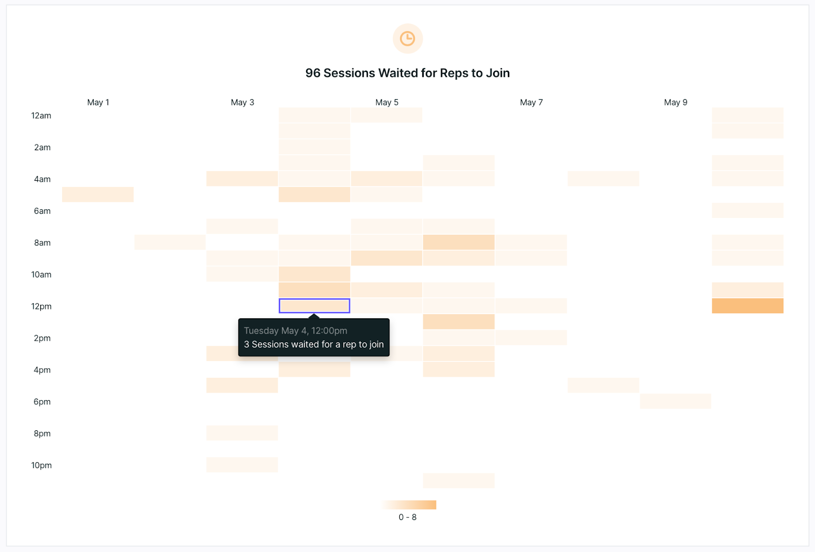
When a visitor hits your Route for Inbound Chat step within an experience they’ll be routed to your sales team according to the routing rules set within your account.
This dashboard tile will show how many visitors hit that step and then waited for a representative to join the conversation, regardless if they were shown the meeting booker or engaged in live conversation.
Reps available
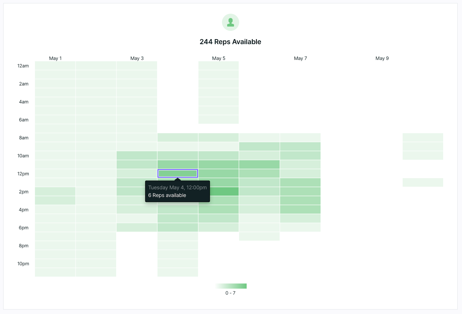
The Reps Available dashboard shows all reps that were available at each hour throughout a day.
At this time, it’s not possible to drill down into each tile to see which reps were available during the time selected.
Session waited and had a conversation
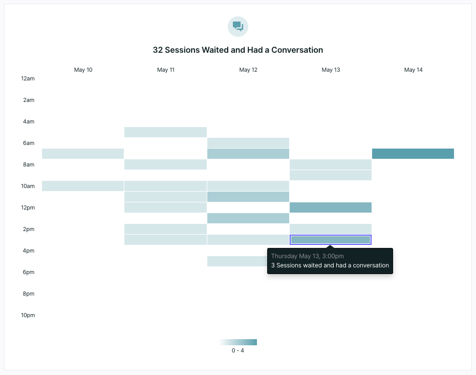
This dashboard tile shows you how many visitor sessions hit your Route for Inbound Chat step within your experience or were otherwise routed to your sales team and successfully had a conversation with someone on your team.
Sessions waited and had no conversation
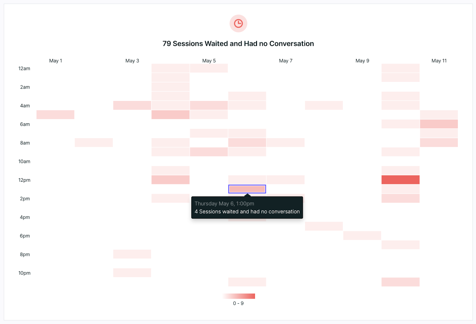
This last dashboard tile will show the number of sessions during your selected date range where a visitor was routed for chat but a rep never picked up. At this time either a meeting could have been booked, or the visitor could have left the site without a chat or meeting being booked.
Click on the date on the top of each column to drill down into a report of the tile to see more information about these visitors, including to see if they booked a meeting.
A high count here can mean reps need their sound alerts on so they can join a conversation as soon as a visitor is routed for chat, or that more reps need to be available.
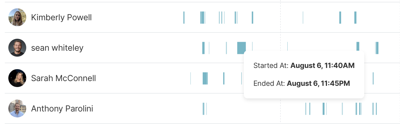
Rep availability
Qualified will show you how often and how long reps have been available. Hover over the blue markers to see the times the rep turned themselves to 'available' and when they went offline. You'll notice two important numbers from this availability is also carried over to your leaderboard tile: "Total Available Hours" and "Avg. Daily Hours."
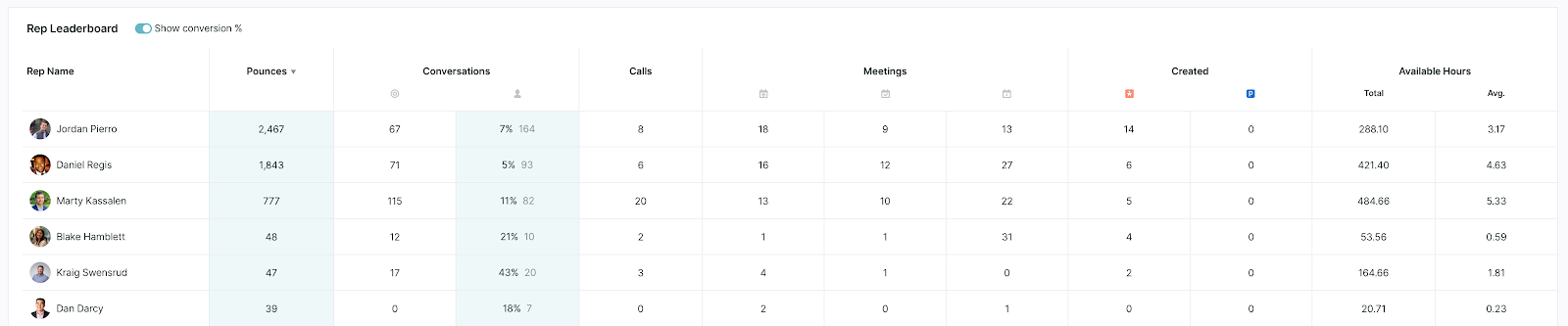
Sales rep leaderboard
At the bottom of your dashboard, you'll see a leaderboard showing which of your reps are engaging the most with your visitors. This includes:
- Pounces (or proactive engagement with visitors)
- Conversations (routed and proactive)
- Percentage of proactive engagements that resulted in a conversation with a visitor
- Calls completed with a visitor
- Number of meetings offered
- Number of meetings booked
- Number of leads or prospects created
- Total available hours
Set your date range by using the date picker on the right-hand side of your screen to select the dates you wish to view.
When you select a time frame on the first dashboard tile, the same date and time are selected on every tile. Use this to keep track of the same time frame across multiple tiles.
How to share and view dashboards
Sharing dashboards allows you to share with non Qualified users by granting them access to view your dashboards. Here's a step-by-step guide on how to share and view dashboards.
Sharing dashboards
- Permission required: You need the "Permission to share dashboards." All admins have this permission by default.
- Locate the share icon: On both personal and team dashboards, find the "Share dashboard" icon at the top right, next to the "Add tile" icon.

- Open the sharing dialog: Click the "Share dashboard" icon to open a sharing dialog box.
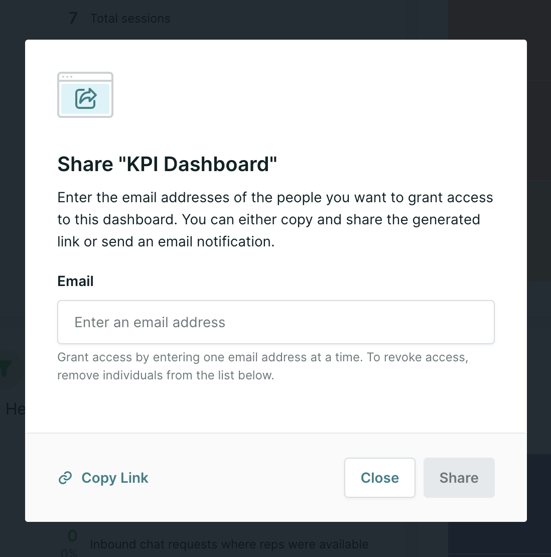
- Add or remove emails:
- Add the email addresses of those you want to share the dashboard with.
- You can also remove existing emails to revoke their access.
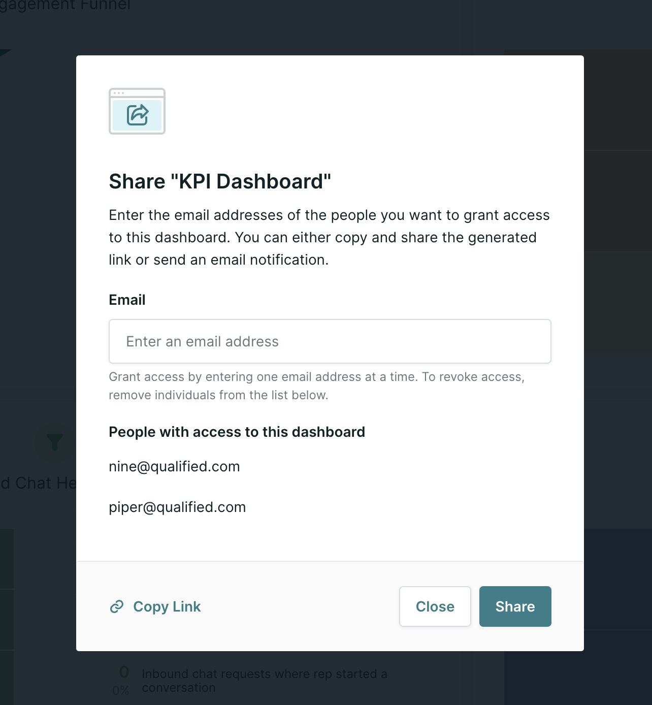
- Share: Click "Share" to send an email notification to users who have been granted access to the dashboard.
- (Optional) Copy link: Click "Copy Link" to generate a general link for all viewers.
- (Optional) Distribute the link: Share the copied link with viewers via Slack, email, or other communication channels.
Viewing dashboards
Viewing from an email notification
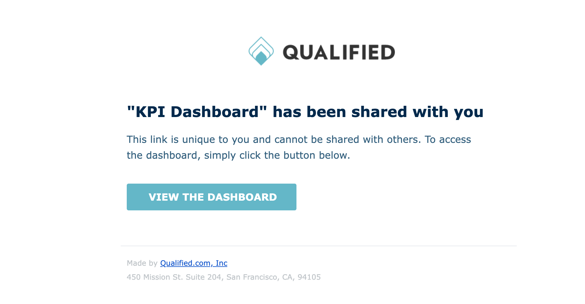
The email notification sent when "Share" was pressed contains a button that will allow viewers immediate view-only access to the dashboard.
Viewing the dashboard from a shared link
- Click the shared link:
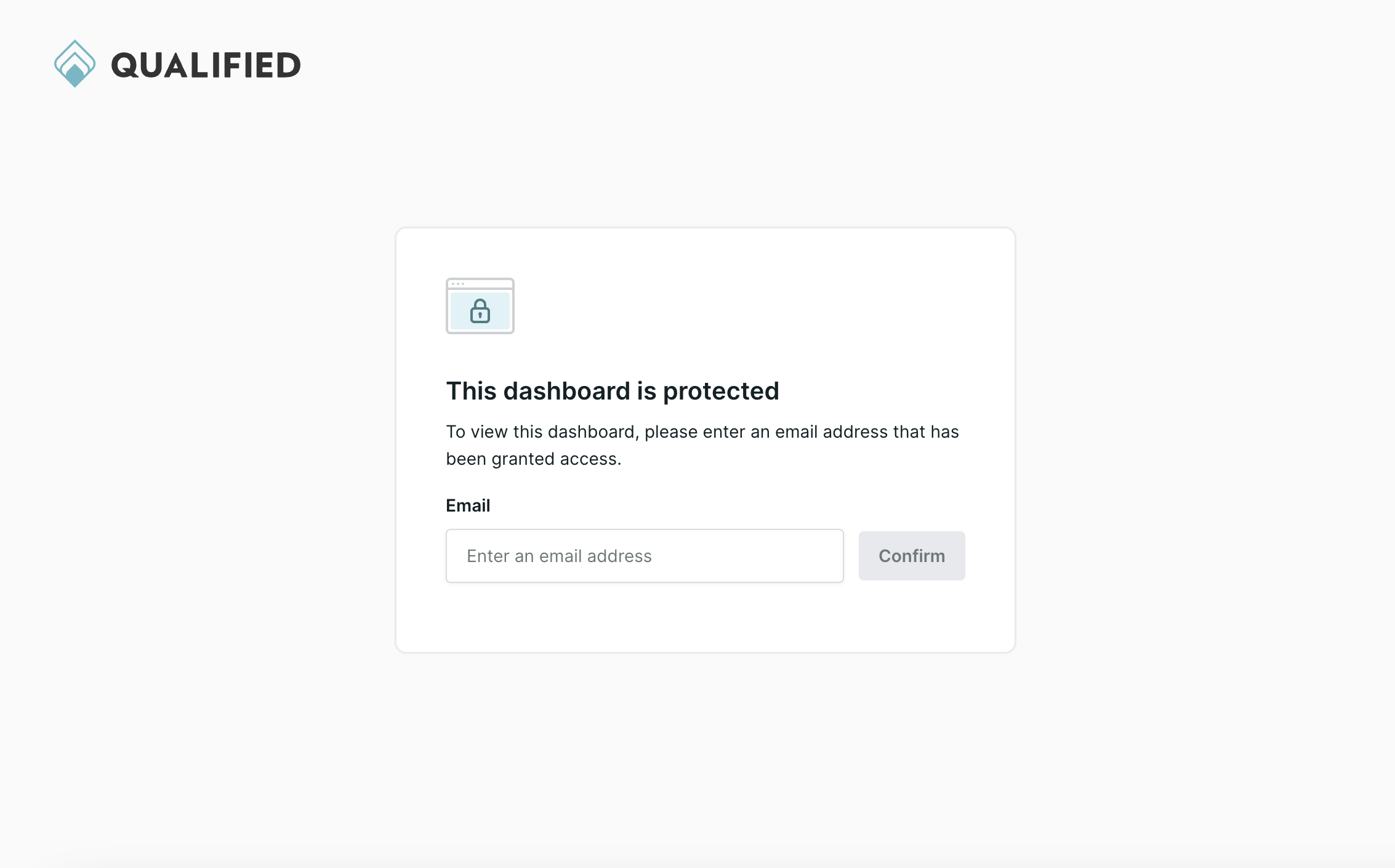
Viewers will receive a link starting withapp.qualified.com/view/dashboards - Enter email for verification:
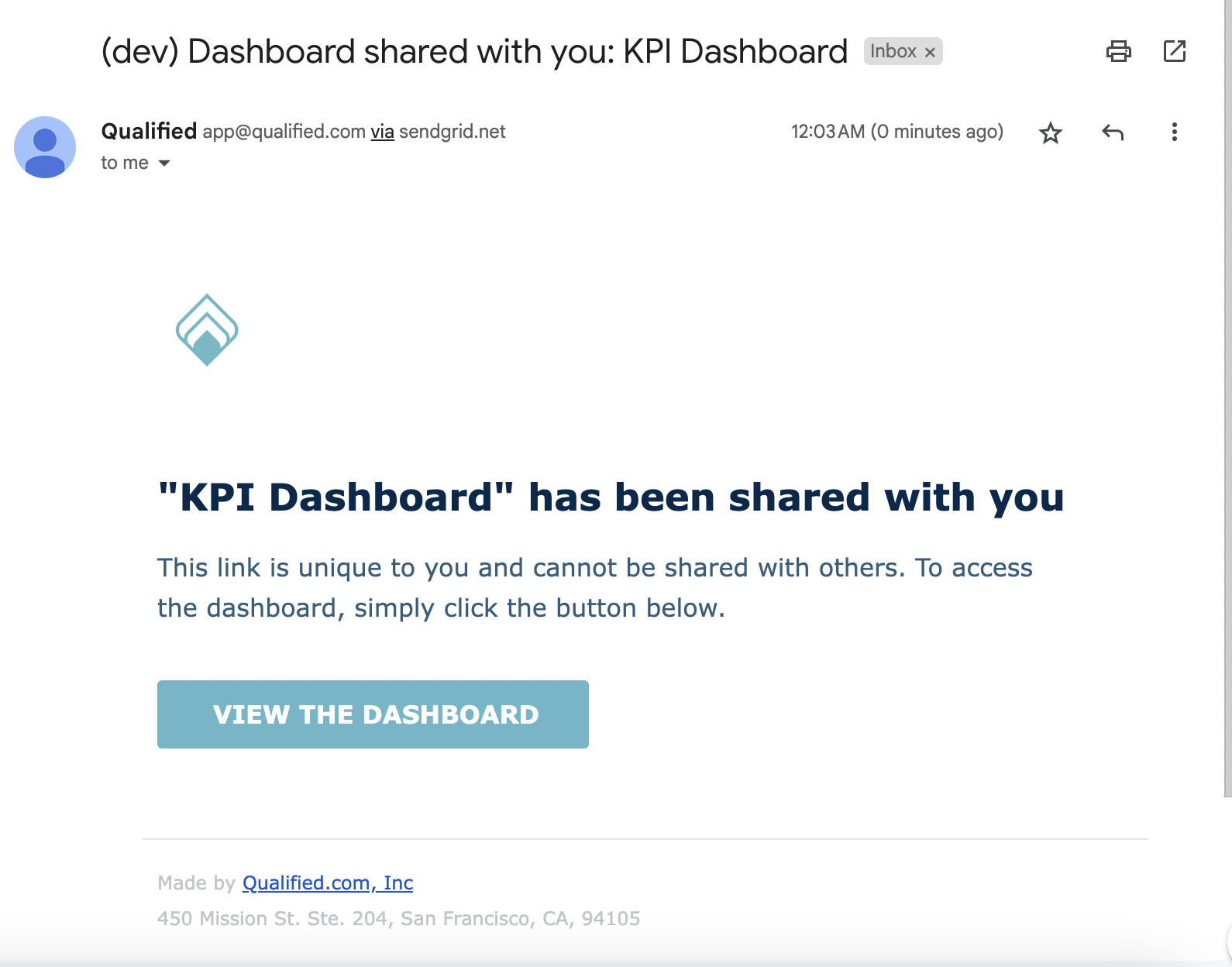
Upon clicking the link, viewers will see a page prompting them to enter their email. After entering their email and clicking confirm, they will receive an email from Qualified with the subject "Dashboard shared with you: <dashboard's title>."
- Access the dashboard:
The email will contain a unique, one-time link to view the dashboard. This link includes an email_token parameter to verify access and is valid for 1 hour. If the link is not used within 1 hour, viewers will need to request access again.
- View-only mode:
Clicking the one-time link will take viewers to a view-only version of the dashboard. Viewers cannot add new tiles or adjust filters but can change the date range and switch between Daily/Weekly/Monthly views for line and bar charts. - General link access:
After using the one-time link once, viewers can access the dashboard using the general link unless:
- The user's permission is revoked.
- The viewer clears their browsing history (cookies).